Energy Yields
What’s an energy yield?
Energy yields with wind farms refer to the amount of electrical energy that can be produced by a wind farm over a given period, usually a year.
Before a wind farm is built, pre-construction yield assessments are performed to determine the energy yield of the wind farm. Pre-construction yield assessments are used to inform the design of the wind farm and to determine the economic viability of the project. After some time has passed and the wind farm has been operating for a number of months, the energy yield of a wind farm can be assessed using real operational data. This is called a post-construction yield assessment, and it helps to highlight where losses are occuring and provide a more accurate picture of the energy yield of the wind farm. Alongside many other techniques, it helps wind farm owners understand their assets and make informed decisions about their operation.
I figured out that there’s a lot of data available from the Balancing Mechanism which provides insight in the wind farm generation. Combine this with weather data and we can start to understand the energy yield of wind farms in the UK. So I did that. And I also tried to figure out how much of the annual energy yield is being curtailed (i.e. wasted). I did that too. And I made a map. And some plots. And I wrote this blog post. If you find it interesting and useful please let me know.
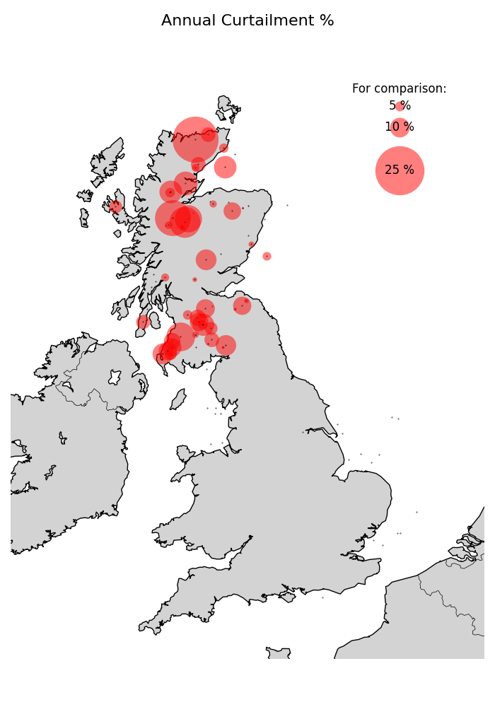
Energy Wasted (%)
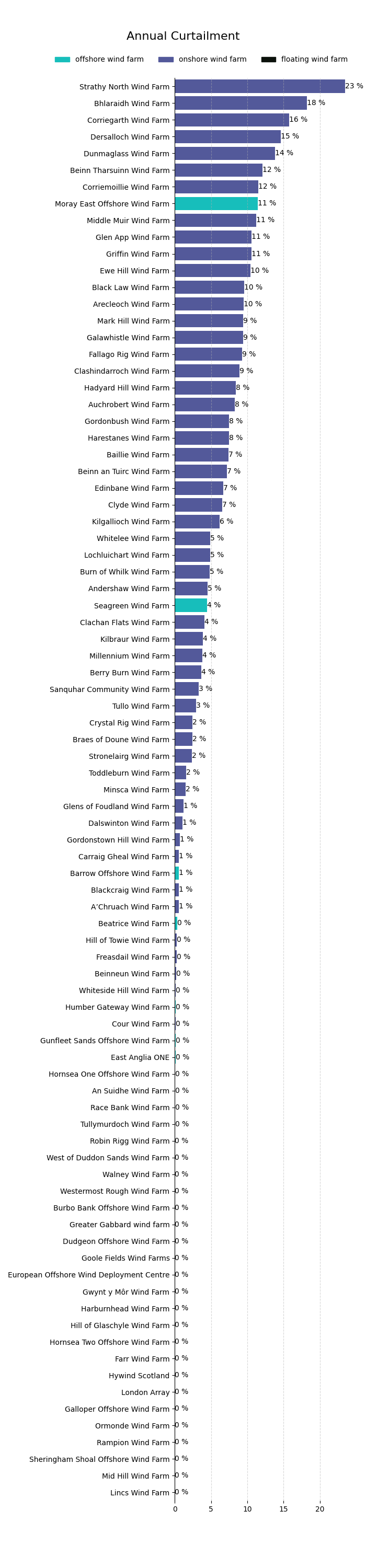
At first glance, it looks quite shocking how much energy (as a proportion of annual production) is being wasted by some wind farms in Scotland:
Let’s plot that as a bar chart as well:
But if you look at the totals in the context of the actual yield, the numbers are a large percentage of a small number and that’s important (this is explained further down in this page).
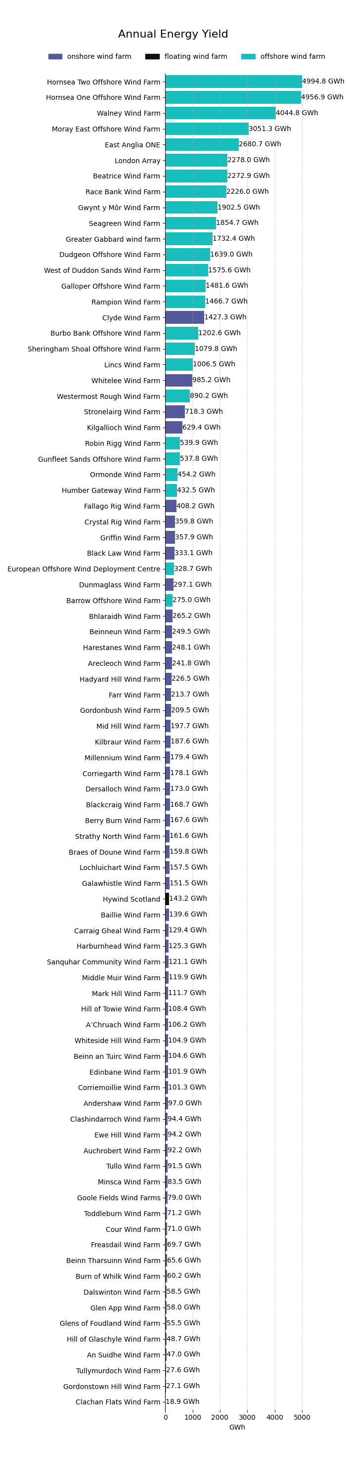
Energy Generated: Totals (GWh)
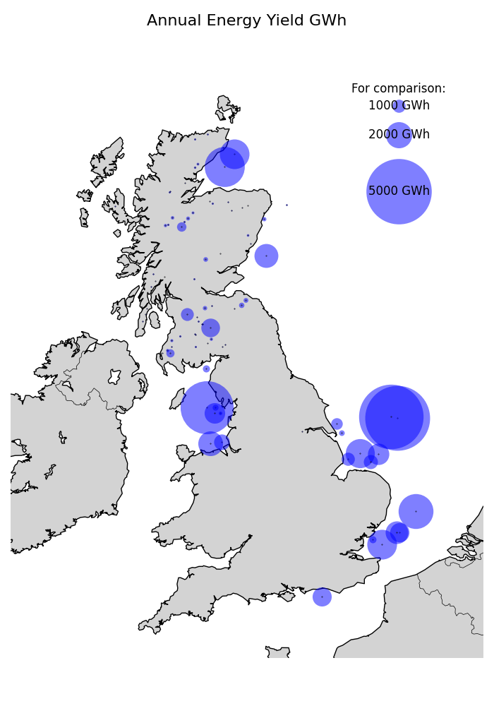
The plot below shows what the typical year’s production is for each wind farm that I’ve been able to find data for. The wind farms are sorted by their annual typical expected energy yield, with the largest wind farms at the top. Can you see a theme?
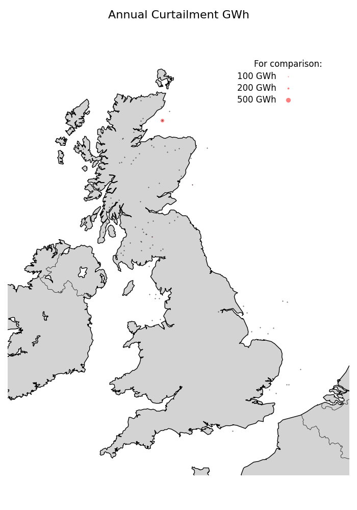
Energy wasted: Totals (GWh)
Let’s now look at the actual volumes being curtailed. The scale of the circles is the same as the scale of the circles in the previous plot. What we see is that the vast majority of the curtailment is happening at the smaller onshore wind farms north of the Scottish Border. The size of the circles is much smaller than the size of the circles in the previous plot.